


August 14, 2013
Gorky Hotel
Hospital Case
Hospital Case
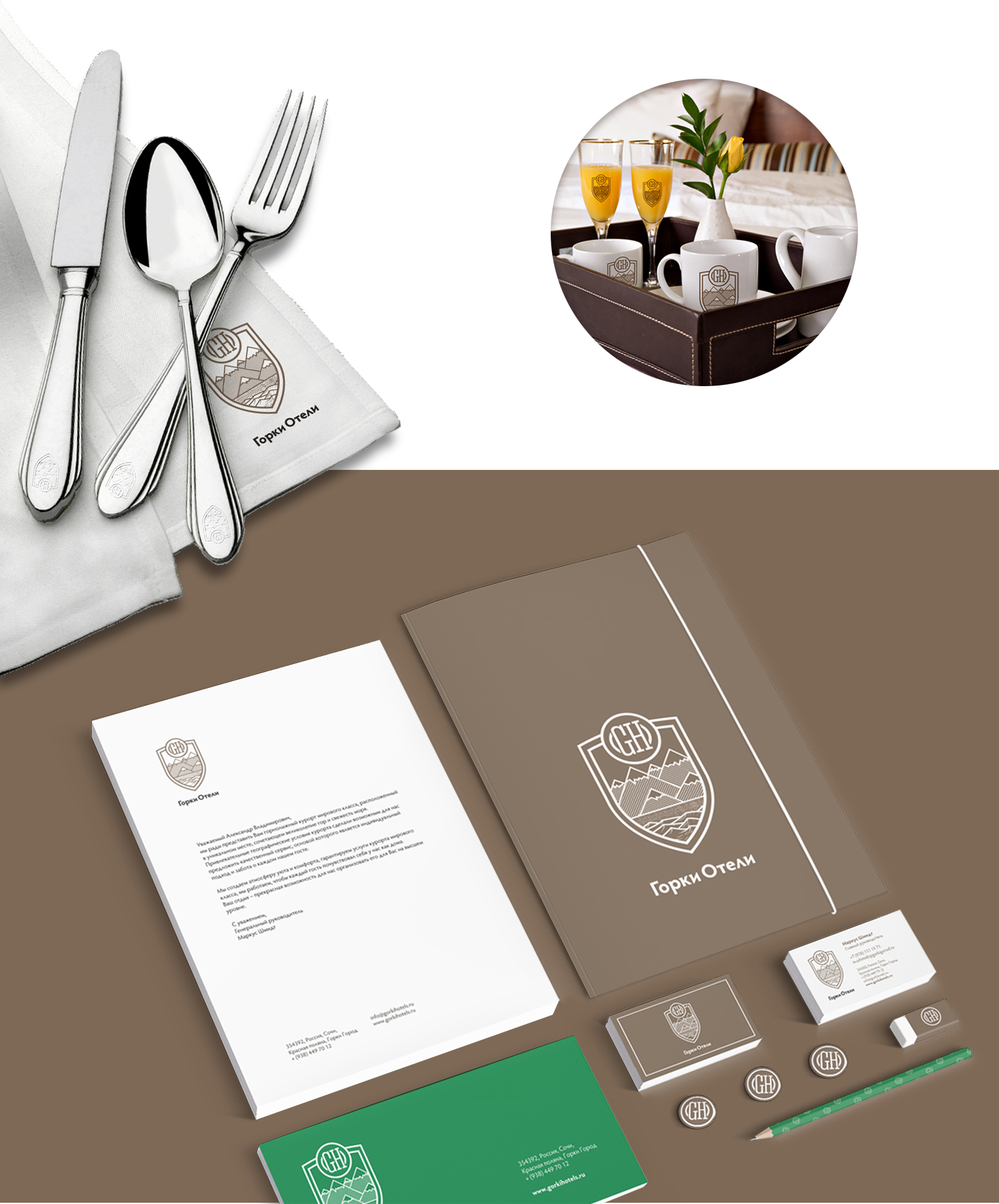
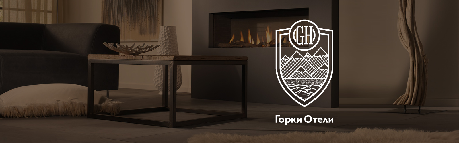
A long-awaited event: a project on logo, corporate style and business stationary development for Gorky Hotel umbrella brand is declared finished.
Thanks, we received your request!
We will contact you shortly.
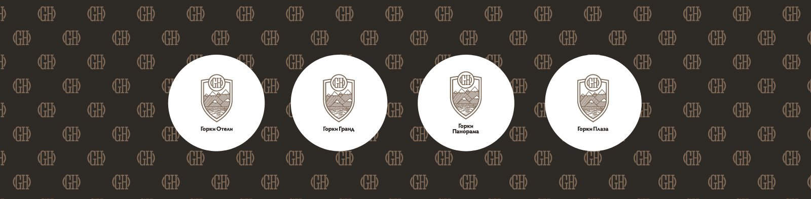
The Gorky Hotel brand comprises three large hotels: Gorky Plaza, Gorky Grand, and Gorky Panorama. Each hotel has its own logo meaning a unique corporate style but implying various names.
The symbol is based on the escutcheon with a ligature composed by hotels names’ capital letters. The symbol general form is an allusion to classical heraldic tradition. A stylized finial and a shield bottom highlight the unique venue location somewhere between the sea and the mountains.
Conservatism, restraint, trustworthiness, reputation provoking respect and high-level comfort – this is the message of the Gorky Hotels corporate style.
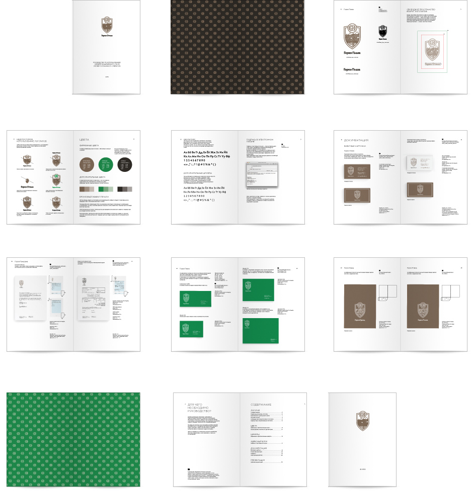
The logo light version has been specially designed for small flat formats and is used in souvenirs branding and hotels outdoor signs.
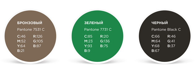
Hotels core corporate colors are bronze, green and black.
All colors are performed in three systems – Pantones for ready-made dyes, CMYK for mixed dyes, and RGB for web use.
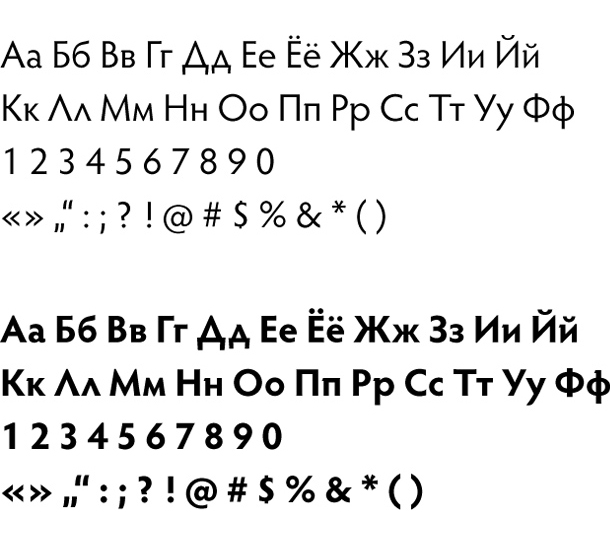
All materials referring to hotels are designed using the same font family - Hypatia Sans Pro.
Is used for the main text in corporate materials, headers and footers, numbers and comments.
Is used to highlight titles and important text pieces. Can be used for highlighting, though we advice to use italics in the main text to do so, since the bold effect is noticed long before the person actually reads the information in bold.
The font has a number of styles to be used in advertising materials typography — Extra Light, Light, Semibold, Black.
Conservatism, restraint, trustworthiness, reputation provoking respect and high-level comfort – this is the message of the Gorky Hotels corporate style.